Sigh. Just when you were getting into a regular routine schmoozing with your network on LinkedIn … Poof! Everything changed. Yep, another redesign — this one intended to more “easily surface ideas, drive conversations … be more productive and stay connected,” according to LinkedIn. The new experience is being rolled out gradually with some features and functionality not yet widely available.
Change is hard
We all have too much to do and too little time … so adapting to user experience changes — even if they are ultimately positive — can be irritating. So to save you some frustration (and a few precious minutes), we’re offering guidance on how to accomplish some key items in the new LinkedIn experience.
 1. Find people (and more)
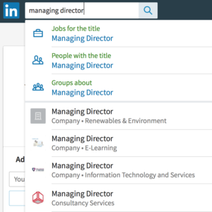
A search box at the top left of every page allows you to search for people (connections or not), companies, jobs, groups and schools all from one place. Searching on a function — for example, Managing Director — provides filters for jobs, groups and people who hold the title, as well as specific listings for individuals.
2. Privacy & settings, front and center!
The new experience to access your privacy and settings is actually a significant improvement. Find it (quite intuitively) through the “Me” link under your profile photo on the top nav bar. Go to Account and scroll to Settings & Privacy. The redesigned page has three sub-menus across the top — Account, Privacy and Communications — with sub-menus for each listed vertically at left.
3. Got groups?
The redesign includes Groups under the Work menu accessible from the top nav bar. The resulting page is fairly similar to the prior layout, with access to Your Groups and new groups (Discover) toward the top of the page and your most active groups listed on the right side of the page. Settings relating to groups are reached via the gear icon on the top right side of the page.
4. Your missing in-box
Oddly, messages and invitations are accessed separately in the redesign. While messages can be accessed via the Messages icon with the speech bubbles icon easily found on the top nav bar, received invitations are located (illogically) within the My Network menu. Click the Manage all link next to Received Invitations to reach a page where you can sort by received and sent invitations. While not widely available yet, the redesign also introduces an embedded chat interface which enables you to instant chat with any of your connections. It’s being rolled out gradually and will be accessible on the bottom right of any page.
Not ready for prime-time?
The problem with redesigns is that little bits of functionality can get lost in the shuffle. Sometimes the application owners decide that these items aren’t highly valued by users, or they may be cumbersome to integrate with a new design. These features may be implemented at a later date or lost forever.
This particular LinkedIn redesign eliminates your personal notes on profiles of connections and the How you rank feature. Still in development are the ability to rearrange sections on your profile, sort your feed updates by top versus recent and various elements of company page functionality.
Ready to put LinkedIn to work for you? Start with these posts to get started, or contact us for one-on-one support.
5 LinkedIn Tips To Create A Positive Online Impression
Maximizing LinkedIn Effectiveness: Not A One-Time Activity


This is very useful information. It saves me time and frustration with the new LinkedIn update.
One of my connections noticed I lost some of my experience when it got updated so I had to add that back in.
Thanks for your comment, Jane. While redesigns are initiated with good intentions, the initial effect on users is typically negative, while they become accustomed to the new experience. And pre-launch testing must be very robust to avoid issues like your missing profile information. In my work with Verizon.com, we had extremely detailed testing plans to try to avoid any post-launch gaps.