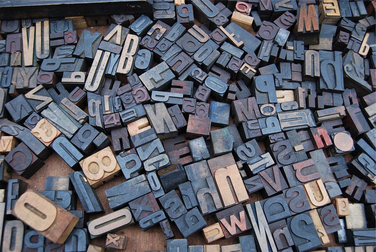
What’s In A Font?
When you have roughly three seconds to convince a website visitor that your site is of value to them, everything matters. Big things — like ensuring your message comes through clearly and quickly. Little details — like and layout and readability. Lack of attention to these details can mean a poor user experience, leading to loss of a potential customer.
Your website is the online expression of your business, so you want it to create a positive impression and convey credibility. You’ve invested time and resources to craft messaging, create the perfect logo, locate images with the right feel, and refine your design, colors, and layout to appeal to your target user.
Choose font styles consistent with your business brand
Focus the same attention on your choice of fonts. Fonts can be formal or conservative, unconventional or playful. While your web designer should provide guidance and an informed opinion, be mindful that typeface details can reinforce — or conflict with — your intended messaging.
 Use a font style that is consistent with your business brand. A conservative serif font such as Times New Roman is appropriate for a financial or insurance company, while a script font could be suitable for a bridal salon. An informal font such as Comic Sans is consistent with the brand for an organic granola company but not for a medical practice.
Readability and the user experience
Typography and design also impact the user experience. Web visitors scan, making vertical spacing and readability important factors to retain visitors on your site. Clean, non serif fonts are easiest to read on a screen, and dark fonts on light backgrounds provide the best contrast.
Size matters. Larger, bold fonts tell users and search engines that they are looking at headline copy and it’s important. Utilize a typography hierarchy to convey the relative importance of the information on your site. In addition to size, font styles should be used thoughtfully to help guide the user:
- Restrict use of underlined font to hyperlinks
- Nested fonts indicate navigation path (example below)
- Use color with intention — colors have meanings and evoke feelings in the visitor
![]() If you update your own website through a content management system, be attentive to the font style when you edit copy, and be sure to maintain a consistent font family throughout the site.
If you update your own website through a content management system, be attentive to the font style when you edit copy, and be sure to maintain a consistent font family throughout the site.
Tip: Use standard fonts to ensure your pages are readable on any computer or device.
Stay tuned for future blog posts about other ways to optimize the user experience, or see our email newsletter archives.


In a perfect world, a business’ website will have been professionally designed (and these days, will include a content management system, too). Appropriate fonts and styles will be part of the site design. When that’s the case, making content updates using the established styles will ensure that the website’s design integrity is maintained.
Appreciate your comment, Rochelle. While content management systems like WordPress enable site owners to self edit, it’s still easy to make errors that impact a site’s usability without realizing it — for example, use of underline for emphasis, which looks like a hyperlink. The key is to be aware, and challenge oneself to maintain the integrity of the site with each new edit.
Good point, Nancy. I realize that people who don’t work with type often think about things like underscores for emphasis in ways a designer would not. And, of course, since underscores usually indicate links, you would not want people to be confused and frustrated when something looks like, but is not, a link.
The best bet is to model edits after the initial content styling on the site — and while avoiding underscores, also try not to overdo the use of bold-face and italics. I also think it’s a good reminder for people to pay attention to the head and sub-head hierarchies throughout the site. That enables users to move through the site and understand the content with ease.
When I first started reading your post I was skeptical. Then I thought about it, and when I see a site with messed up fonts, layout or spelling, the subtle message I get is that it’s a site that was just slapped up on-line, not a professional, trustworthy business. So I guess your point is well taken. Thank-you.
Thanks for your comment, Walter. Whether we are business owners or other professionals, we need to exercise care to convey competence in every interaction with a potential customer.