Event Review: Boston User Experience (UXPA) Annual Conference
 Last week I attended the annual conference for the Boston Chapter of the User Experience Professionals Association (UXPA)
. The conference offers members an opportunity to learn about new techniques, tools and research, as well as a venue to converse with other user experience professionals. The schedule provided a wide variety of sessions to choose from, targeted to the interests of user experience consultants, graphic designers, developers, app designers, user experience researchers, specialists in user interface design and product managers.
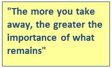
One theme that resonated throughout the day was “minimize.” Whether writing content for a mobile-responsive site or designing a user experience for a new app, the message was to pare back the design elements, required steps and content. A presentation by user experience design and testing team Amy Rizzico and Carolyn Snyder illustrated the complexity of this task and reinforced the significance of effective content: the more you take away, the greater the importance of what remains. All remaining elements must be clear and precise.

Addressing the issue of responsive design (which adjusts the user experience based on the device being used), presentations recommended designing with consideration of the capabilities of the particular device, rather than resolutely forcing a design that is incompatible with the functionality of a device.
Well-crafted details make a big difference
In a highly engaging presentation called “An Emergency Content Strategy Survival Guide,” Heather O’Neill of Above The Fold shared a case study to illustrate the importance of ensuring your site visitors “get” your intended message quickly. She tested home page concepts using five second tests and used post-launch A/B testing to gauge effectiveness of headlines, content, buttons and navigation. She highlighted several key points:
- Weigh all content elements and navigation to ensure consistency with the core message
- Don’t neglect the user experience of website forms and error messages
- More important than the details of personas are their needs and goals, to ensure site content and user experience responds to them
- Test website concepts to gauge effectiveness of copy and navigation
Engage and entertain
In today’s digital world, users expect websites and applications to be engaging and entertaining. Moving beyond usability, Mad*Pow user experience researcher Susan Mercer shared testing techniques to assess site usefulness and desirability. These tools, including some borrowed from psychology and marketing research, offer both qualitative and quantitative data that can be used to evaluate a user interface.
Is your website effective, user-friendly and engaging? Please contact us for a free consultation.


