 Fast and furious. Our world is technology-obsessed, on-the-move, and bordering on fanatical about staying connected. In the early days, when mobile devices were a novelty, we had more tolerance for poor user experiences like dropped calls and sites that were difficult to navigate. As we acclimate to each new technology and spend ever-increasing amounts of time on mobile devices, expectations are rising.
Are your emails easy to consume?
In a recent article, we discussed the usability issues related to websites not optimized for mobile:
While we may be accustomed — or resigned to — scrolling and pinching to magnify tiny text on a mobile device, it’s not an ideal user experience. A mobile responsive website adapts the page layout to present the information in a format appropriate for the device.
Similar to the shifts in search algorithms to reward mobile-friendly websites, the recipients of our emails can decide whether to bother with an email that is not mobile-friendly.
While social media may get more hype, email marketing remains an extremely effective marketing tool. According to eMarketer, for nearly 70% of online users in the US, email is the preferred method of communicating with businesses. Since contacts on your list have opted in to receive your emails, they are warm leads who are receptive to your content – but not if you make it difficult to consume.
Time to get mobile-savvy
The numbers of emails opened on a mobile device are skyrocketing. According to a US Consumer Device Preference Report, in the US, an astounding 65% of all email is opened on a mobile device. If you’re investing in email marketing as a lead generation strategy, it’s time to raise the bar to ensure your emails are readable on a tablet or smartphone. A mobile-responsive email, like a mobile responsive website, modifies the content layout to match the viewing device.
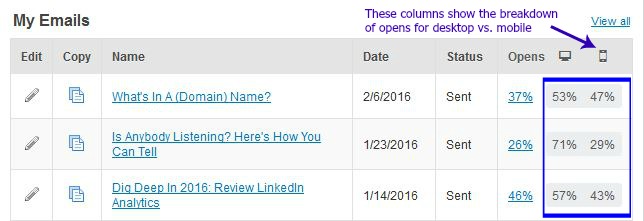
Your email marketing analytics show the percentage of recipients that open your emails on a mobile device.
The need for speed
Mobile responsive email templates are simpler, with fewer images, no sidebars and a single block of copy. Because the content of the email is stacked vertically when viewed on a mobile device, it’s important to cut back on the amount of content to avoid a need for significant scrolling. Tease your reader with a few well-written, intriguing paragraphs and use a strong call to action to encourage a click-through to your website or blog.
Select a template that’s mobile-responsive
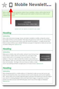
 Within your email marketing platform, find a mobile responsive template by searching the words “mobile responsive” or looking for the mobile indicator. Keep in mind that there’s a difference between a mobile template and a mobile-responsive template (more about that here). Once you select a mobile-responsive template, use the checklist below to optimize your email for tablets and smartphones.
Checklist – using a mobile responsive email template:
* Simple, clean design with one to three images
* Concisely written content – target 20 lines of text or fewer
* Body copy of at least 14 point font
* One content topic
* Few, well-spaced links for easy click-through with a finger tap
If you need help optimizing your email marketing, see these other posts or contact us.


Great post. Your advice actually makes it easier to get my newsletter out on time because I don’t have to write as much or spend forever finding pictures. Win-win!
Glad to hear it, Mike. I agree that finding compelling images to enhance your email or blog post can take a lot of time and crafting a streamlined, mobile responsive email newsletter can be much quicker than the traditional templates with sidebar articles. On the content side, one caution: you only have a few paragraphs — be sure your message is sufficiently compelling to capture and retain your reader’s attention.
I had no idea that there were email marketing responsive templates. Thank you for this information, it was very helpful and specific!
Glad it was helpful Leisha. We strive to offer specific, actionable information in our posts.