A picture tells 1000 words. But context is needed as well. Today’s website visitors have very short attention spans. To retain their focus, your website needs to be informative, intuitive and visually engaging. Unremarkable content and you won’t differentiate your business sufficiently. Too technical and your visitors will click away in irritation. But don’t go too lean: Err on the side of extreme brevity and your site won’t rank well in search results.
In addition to original, meaningful and succinct content, a well-executed, optimized website has both:
- A logical, purposeful site architecture that …
- provides easily accessible high-level information with the option to view more detail, if desired
- organizes site content in a logical way that enables visitors to easily find what they need
- A highly navigable, appealing and engaging user experience, with …
- thoughtful design that’s mobile-responsive and secure (https)
- balanced use of color and white space
- creative graphical elements and imagery
- appropriately placed sub-headings to organize content
- embedded links to guide visitors to additional information
Review these tips for conveying information in an engaging way that keeps visitors on your site.
1. Guide users with visual links
Embedded links are important to guide visitors to further detail on a topic. Don’t rely exclusively on contextual links, though. Visual elements offer a more engaging user experience to direct a visitor to deeper content — for example, Frequently Asked Questions, news articles, your events calendar or email newsletter signup. Visual elements may be photographs, illustrations or graphical images and can include words.

Graphical elements should be strategically placed to “tease” a user to view relevant content. For example, a visual link to an Events page featuring workshops and training opportunities would be appropriately placed within an instructive blog post.
2. Set the mood through photographs
A large featured image at the top of a page can set a mood for your website page or blog article, while capturing attention of readers. As an example, the photo below was used in a blog post published on the Monday after Thanksgiving. (Enough said?) While the ideal way to illustrate your business is to hire a professional photographer to capture authentic photos, that’s not always a viable solution.

In certain industries, privacy or other concerns make it challenging to find appropriate photographs to use on a website or customer-facing materials. Medical practices, organizations serving children, technology- and service-based businesses may need to consider other options. One of our clients, Roman Music Therapy Services, has utilized graphical elements very effectively on their website.
Fortunately, photo purchasing sites like iStock, Big Stock Photo and Deposit Photos provide very good alternatives, with the ability to filter searches for photographs, vectors, clip art, icons or illustrations. Royalty-free images, including vectors and icons, are also available from free-for-use image sites.
3. Use graphics to create relatability
Do potential clients relate to your website content? The “me-too” effect offers a powerful allure, engaging and encouraging visitors to explore further. Consider these examples:
Member demographics: A membership organization can demonstrate strong fit for potential members with visuals like a pie chart showing breakdown of members by company size or industry. For example, if your target clients are wellness practitioners (massage therapists, yoga or fitness studios, nutritionists and the like), a Chamber of Commerce with a large number of members in this sector could be a good fit for your company.
Customer case studies: Displaying a list of customers can instill credibility for your business with a potential customer. But consider raising the bar and creating a more interactive experience with a customer case studies page that explains the work involved and includes customer logos. (Be sure to request client permission before using logos). A case study for an entirely different industry can spark interest in a prospect because it relates to a similar issue in their company.
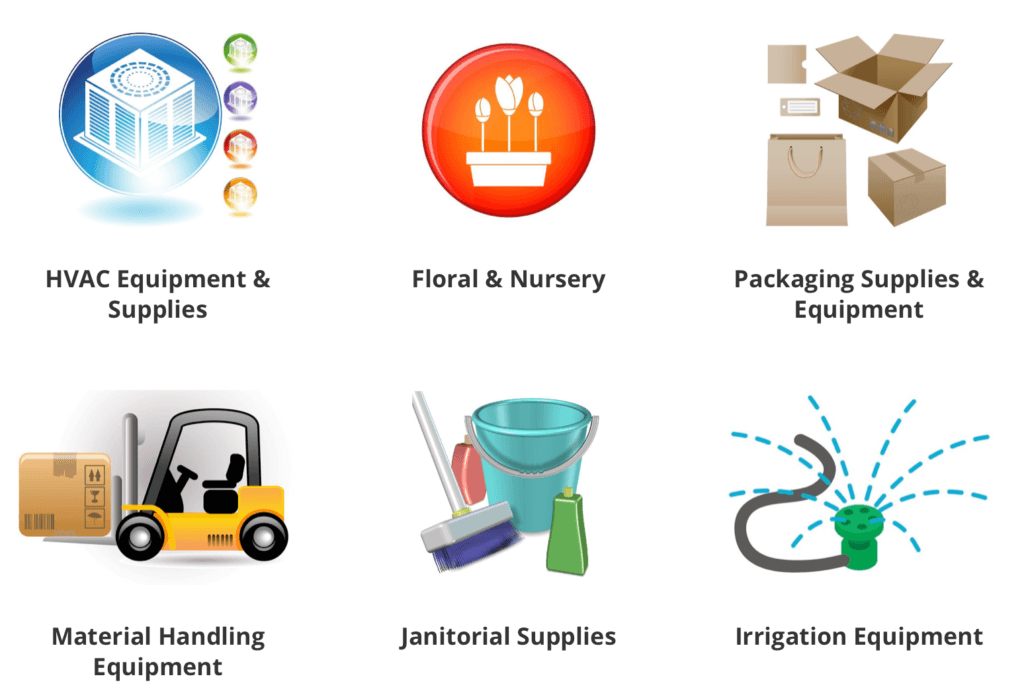
Industries served: Graphical images can also be used to convey the industries that your company serves. The visual example below is much more engaging a simple written list of industries served by this company. An image of their or a related industry can help a potential customer feel more connected to your product or brand.

4. Convey authority with badges

Top Doctors? Best Lawyers In America? Zagat-Rated?
Another valuable way to use graphical elements is to display professional certifications, badges for accreditations you’ve received, and/or logos of membership organizations you’re actively involved with.
Security badges such as (VeriSign or Geotrust) and testimonials also enhance your credibility.
5. Add visuals to supplement and organize content
For industries that are imagery-focused, this post offers visual ways to use blog functionality to feature your business, your products or your expertise.
Charts, guides and other graphical elements like the infographic below can be used to visually summarize a process or convey a complex idea in a more comprehensible way.

While many online visitors are accustomed to the use of visual icons to indicate links to events calendars and social media accounts, the best way to create a cohesive whole includes both words and graphical elements. Organize visual icons and text under logical sub-headings.
For example, create a user-friendly Contact Us page with a Google map, social icons and physical address, phone and email under sub-heading like Find Us! Don’t assume that all users will click on a Google pin icon to find your office address or your hours; instead, include some contextual words as well.


