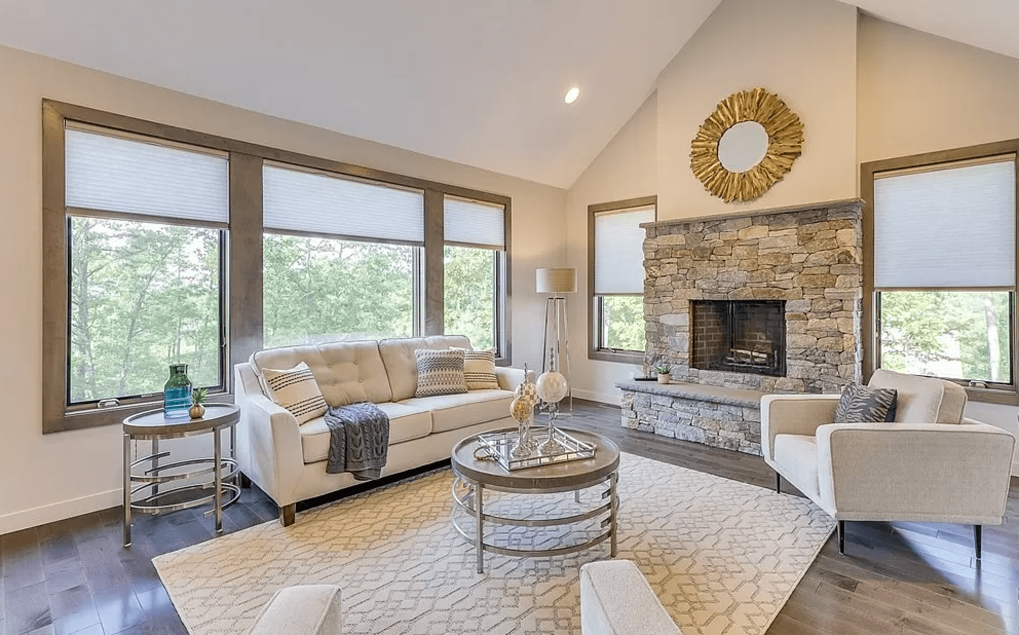
Want your website traffic to mimic the hot real estate market?
Take some pointers from home stagers, who style and prepare properties for sale. Real estate staging enables sellers to present the best possible impression of their property, leading to a swift sale at a strong price.
The conventional wisdom that it takes seven seconds to make a first impression applies to both real estate and to online real estate — your website. In a competitive market, prospects may not stick around if your site doesn’t seem credible, or is cumbersome to navigate.
While the real estate market is sizzling, it’s a seller’s market. In contrast, competing online is essentially a buyer’s market. What can you do to showcase your business for success?
Make a positive first impression
A property’s curb appeal — the view from the street including the facade, lawn, walkway and front door — provides the first impression of the home. A prospective buyer may be wowed or underwhelmed at this point, but the 7-second clock is ticking as they cross the threshold into the entry hall.
Effective staging of the property can make the difference of whether a prospect is eager with anticipation or disenchanted.
Curb appeal applies similarly to online real estate (your website). The initial page a visitor lands on (which may be your home page, a landing page or a blog post) provides a first impression which is likely to foretell next steps.
Is your website exquisitely staged?
- Does the page create a positive impact? Is it pleasing to look at?
- Are the images impactful, or cliché and overused? Are they vivid — or pixelated? Do they load quickly?
- Is the content highly readable, formatted in an appealing way that’s easy to consume?
Uncluttered, navigable design encourages exploration
In a staged home, sparse furnishings and an open, clutter-free space enable buyers to see a home’s features and visualize themselves in the home, unencumbered by personal belongings of the present owners.
Similar goals apply to a website, where readability and intuitive navigation are used to encourage exploration. A well-designed site presents opportunities for perusing and guides visitors naturally to additional information. Use visual elements and online functionality to provide opportunities to delve deeper into the site, but don’t drag every visitor through it. For example:
- Top-level pages that offer a preview of easily accessible interior content
- Headings and sub-headings for easy scanning
- Clickable visual elements like images, graphics or call to action buttons
- Short paragraphs with embedded contextual links for additional information
- Use of teaser text that links to additional content
- A robust, well-designed footer with links to key content
Create visual interest
As with all types of design, web design continues to evolve. Contemporary websites are cleaner and highly visual, with a lot of white space.
The “pop of color” favored by real estate stagers is also used in web design, to highlight headings, call-to-action buttons and visual elements that convey information, such as testimonial graphics, linked social icons and branded seals for certifications or memberships.
In addition to adding informational visual elements like those noted above, WordPress offers formatting features that break up copy and enable authors to highlight certain content. Some examples of this functionality are:
- Media and text – Image with “callout” text of various font sizes
- Quoted content (used for testimonials or interviewee highlights)
- Pullquotes – for author emphasis
- Tiled gallery of images
Exquisite attention to detail makes a difference
Before prospective buyers line up for an open house, a great deal of energy is focused on crafting the property listing. The copy is honed carefully and listing photos are scrutinized to maximize impact. Within a defined listing template, the agent’s goal is to create intrigue and motivate prospective buyers to visit the listed property in person.
For your website, the goal is similar. In addition to carefully cultivating quality photographs and visual elements that reinforce your content, meticulous attention to the words will help attract and retain visitors on your site. Refine post titles and headings for maximum impact, vary phrasing to engage readers — and respect readers by avoiding tech-speak. Available website plugins can analyze your readability and sentence structure.


